Most SaaS dashboards are designed for the product demo. They are built to look impressive in a sales call, loaded with a curated dataset, walked through by a sales rep who knows exactly which widget to point at. On the demo, the dashboard looks powerful and purposeful. Then the customer signs up, their own data flows in, and the experience falls apart.
The demo dashboard and the daily-use dashboard are different design problems. The demo needs to communicate potential. The daily-use dashboard needs to support a decision the user needs to make right now — often in under two minutes, often while doing something else. Most product teams build for the first use case and hope the second works itself out.
It does not.
TL;DR: A SaaS dashboard works when it is designed from the user’s job-to-be-done rather than the data model, gives the most decision-relevant information the most visual weight, and discloses detail progressively instead of showing everything at once. Meaningful empty states, the simplest chart that answers each question, and a readable mobile view of the top KPIs are what separate a daily-use dashboard from a demo dashboard.
Why Dashboards Are Hard to Design Well
A dashboard is an unusually difficult design surface because it compresses multiple information types into a single screen while trying to serve users with different roles, different levels of familiarity, and different questions on any given day.
The temptation is to show everything. If the data is available, surface it. If users might want to know something, put it on the dashboard. The result is a screen where nothing is prioritised, everything is competing for attention, and the user has to do the interpretive work that the design should have done for them.
The second temptation is to replicate the data model. Engineering teams often drive the initial dashboard design, which means the structure mirrors how data is stored — tables become sections, foreign keys become navigation paths, schema names become labels. This is a coherent system from a technical standpoint and a confusing experience from a user standpoint.
Neither approach produces a useful dashboard. The ones that work are built from a different starting point.
Principle 1: Design from the Job-to-be-Done, Not the Data Model
Before laying out a single widget, the design question is: what decision does the user need to make when they open this screen?
Not what data do they have access to. Not what metrics does the business track. What decision. And specifically: what is the minimum information required to make that decision with confidence?
For a customer success manager, the decision might be “which accounts need attention this week?” For a growth marketer, it might be “is this campaign performing well enough to increase spend?” For an ops team lead, it might be “are there any blockers I need to address before the end of today?”
Each of these questions has a direct answer that can be represented clearly on a screen. Each also has supporting context that is useful but not primary. And each has related data that is interesting but not decision-relevant for that user at that moment.
A useful exercise before any dashboard design work: write out the primary job-to-be-done for each user role that will see this screen. Then list the three pieces of information that most directly answer the question that job requires. Those three pieces become the top of the visual hierarchy. Everything else is supporting content.
Principle 2: Data Hierarchy — Visual Weight Follows Decision Weight
Once you know what the most important information is, the design job is to make it visually dominant. This sounds obvious. It is consistently ignored.
On a well-designed dashboard, a user who glances at the screen for three seconds should be able to identify the primary status — whether things are on track, whether attention is needed, whether there is something urgent to act on. That recognition should not require reading. It should come from the visual weight of the most important elements.
KPI cards with large numbers work for this. Color-coded status indicators work. A single prominent chart with a clear trend line works. What does not work is a grid of twelve equal-sized widgets where the most important metric has the same visual weight as the least important one.
The hierarchy rule: the most important signal gets the most visual space, the highest position on the screen, and the strongest visual treatment. The supporting context gets clearly subordinate treatment. Tertiary data is accessible but quiet — small text, collapsed panels, or behind a click.
This means making deliberate choices about what is not prominent, which is harder than it sounds when multiple stakeholders each believe their metric is the most important one.
Principle 3: Progressive Disclosure — Summary First, Detail on Demand
A dashboard that shows everything at once is not more useful than one that shows the summary and lets users drill down. It is less useful, because the cognitive load of parsing everything simultaneously is higher than the cost of a click to see more detail.
The principle of progressive disclosure applied to dashboards: the top level shows summary status. One level down shows the contributing factors. One level further shows the raw data or individual records.
A revenue dashboard at the summary level shows total MRR, month-over-month change, and net new vs. churn. One level down shows MRR by segment or cohort. One level further shows the individual account changes. The first level answers “how are we doing?” The second answers “where is this coming from?” The third answers “what specifically changed?”
All three levels are valuable. They do not all belong on the same screen at the same time. Design the summary to be genuinely readable at a glance — no more information than a user can absorb in ten seconds — and make the path to detail obvious and fast.
Tabs, expandable sections, clickable chart elements that open a detail panel, and links through to dedicated report views all serve this pattern. The key is that the navigation to more detail should feel natural, not like leaving the dashboard to enter a separate product area.
Principle 4: Meaningful Empty States
The empty state is the state most new users see first. Before they have imported data, connected an integration, created any records, or completed any tasks, the dashboard is empty. This is often the first impression a new user has of the product after onboarding — and it is almost always the worst-designed screen in the product.
An empty dashboard that says “No data available” or shows greyed-out widget placeholders communicates nothing about what the product does or what the user should do next. It creates anxiety. The user does not know if they did something wrong, if the product is broken, or if there is more setup required.
An empty state that works does two things. First, it shows the user what the dashboard will look like when it has data — either through an illustrated preview or a pre-loaded demo dataset. This gives them a mental model of what they are working toward. Second, it gives them a direct call to action: the exact step they need to take to make the dashboard useful. Not a link to documentation. Not a generic “get started” button. The specific action: “Connect your first integration,” “Import your customer list,” “Create your first campaign.”
For dashboards with multiple data sources, consider populating individual widgets as each data source is connected, rather than keeping everything empty until all sources are configured. This gives the user incremental progress and early evidence that the product is working.
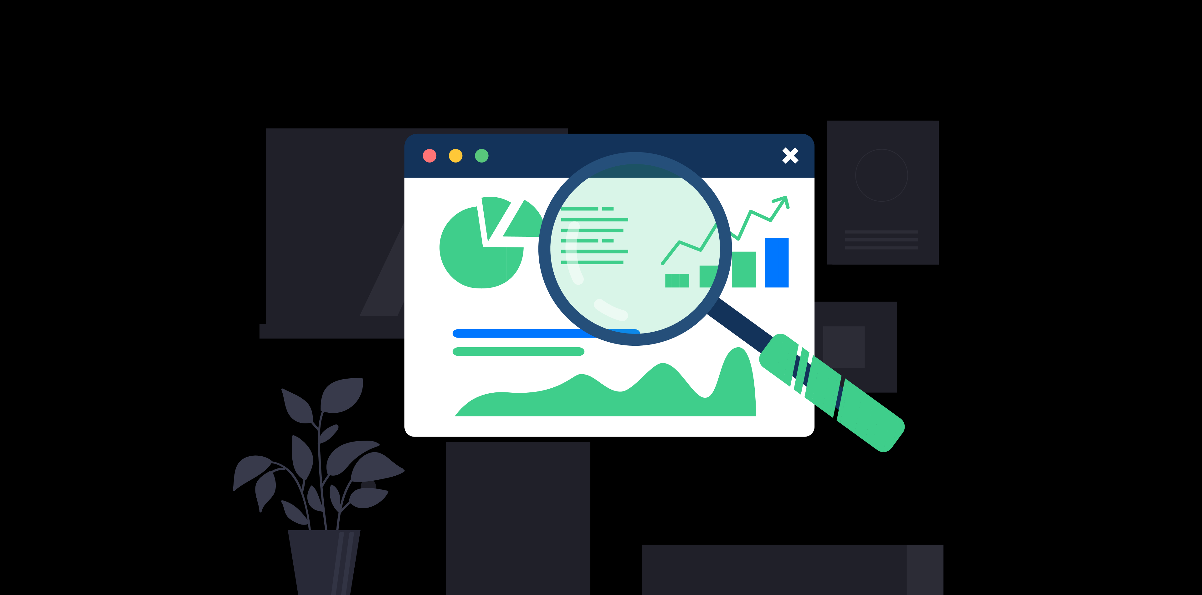
Principle 5: Chart Selection — Use the Simplest Chart That Answers the Question
Every chart on a dashboard should answer a specific, articulable question. If you cannot state the question a chart is answering, it should not be on the dashboard.
The practical guide to chart selection for SaaS dashboards:
- Line charts for trends over time. Is this metric going up, down, or flat? How does this week compare to last week?
- Bar charts for comparisons between discrete categories. Which channel is performing best? How does each team compare?
- KPI cards (single number) for the metric that matters most. What is the current value of the thing I most need to know? Add a delta to show direction, and a sparkline if trend context adds meaning.
- Tables for ranked lists where exact values matter. What are the top ten accounts by revenue? Which items need attention?
- Stacked bars or area charts for part-to-whole relationships over time, used carefully.
Avoid pie charts for more than three segments — humans cannot accurately compare arc sizes beyond that threshold. Avoid dual-axis charts unless the relationship between the two axes is the direct point. Avoid animated charts that look impressive and take longer to read than a static version of the same information.
The question to ask before including any chart: if a user looks at this for five seconds, what do they know that they did not know before? If the answer is “not much” or “it depends on how they read it,” the chart is doing display work rather than communication work.
Principle 6: Mobile Consideration for B2B
The assumption that B2B SaaS users never check dashboards on mobile is false. They check notifications that link to dashboards. They pull up status views in meetings on a tablet. They look at a quick KPI on their phone before a call. The primary usage is desktop, but secondary mobile usage is real and often the moment of highest decision urgency.
The mobile dashboard does not need to replicate the desktop dashboard. It needs to do one thing well: show the top three to five KPIs in a readable format. Large numbers, clear labels, visible delta indicators. Everything else can be behind a scroll or a secondary view.
The practical test: open your dashboard on your phone, do not zoom, and ask whether the most important number on the screen is readable without scrolling. If it is not, the mobile experience needs attention.
Patterns That Consistently Fail
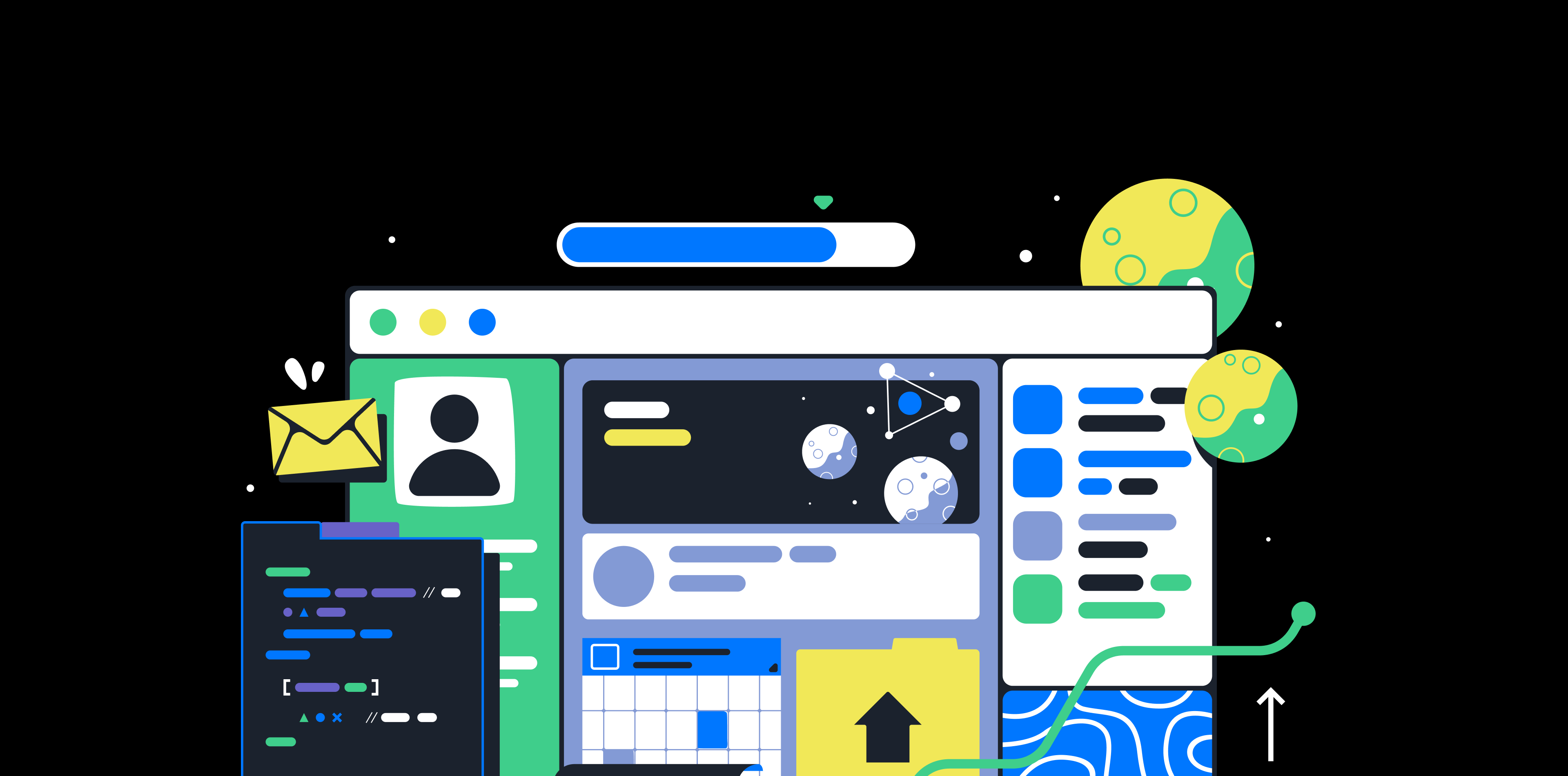
The data dump dashboard. Every available metric is shown, typically in equal-sized widgets arranged in a grid. Users cannot identify what matters. Stakeholders from multiple teams each added their metric and nobody removed anything. The result looks comprehensive and communicates nothing.
The dashboard that requires filters first. The user opens the dashboard and sees no data, or data that is not relevant to them, until they select a date range, a team, or a region. Filters are useful for customisation. They are not acceptable as a prerequisite for seeing anything. Set sensible defaults that show useful data immediately.
Widgets with no relationship to user actions. Metrics that show historical data but provide no signal about what the user should do next are low-value. A dashboard metric should either inform a decision, prompt an action, or provide confirmation that a previous action worked. If it does none of these, its presence needs justification.
The dashboard that looks different from the rest of the product. Dashboards are often designed separately from the rest of the product and end up with different visual patterns, different interaction conventions, and different component styles. Users notice this. It creates a sense that the dashboard is bolted on rather than integrated — and it is usually because it was.
How to Test Whether Your Dashboard Is Working
The simplest test: find a user who is new to the product — someone who has been using it for less than a month — open the dashboard with them, and ask a single question: “Based on what you see here, what do you think you should do next?”
If they can answer clearly and quickly, the hierarchy is working. If they hesitate, scan around, or say “I’m not sure” — the design is not doing its job. The information is probably present somewhere, but the visual weight is not directing them toward the thing that matters.
A secondary test for existing users: ask them to describe, without pointing at the screen, what the three most important things on their dashboard tell them. If the answers are consistent with each other and with the intended design intent, the information architecture is working. If they describe different things or describe secondary metrics as primary, the hierarchy needs reconsideration.
Dashboards that work do not require users to interpret them. They make the interpretation for the user and surface it as clearly as possible.
This pairs well with our guides on reducing churn through SaaS UX design and design systems for SaaS products, as well as our SaaS UX audit guide.
Learn how Celvix approaches SaaS dashboard design and product UX.
Service Offering: Product UX & Design
Celvix helps SaaS teams reduce friction, improve activation, and build design systems that support scale.
Explore SaaS UX Design Service Explore SaaS UX Design Service